FARMHAND
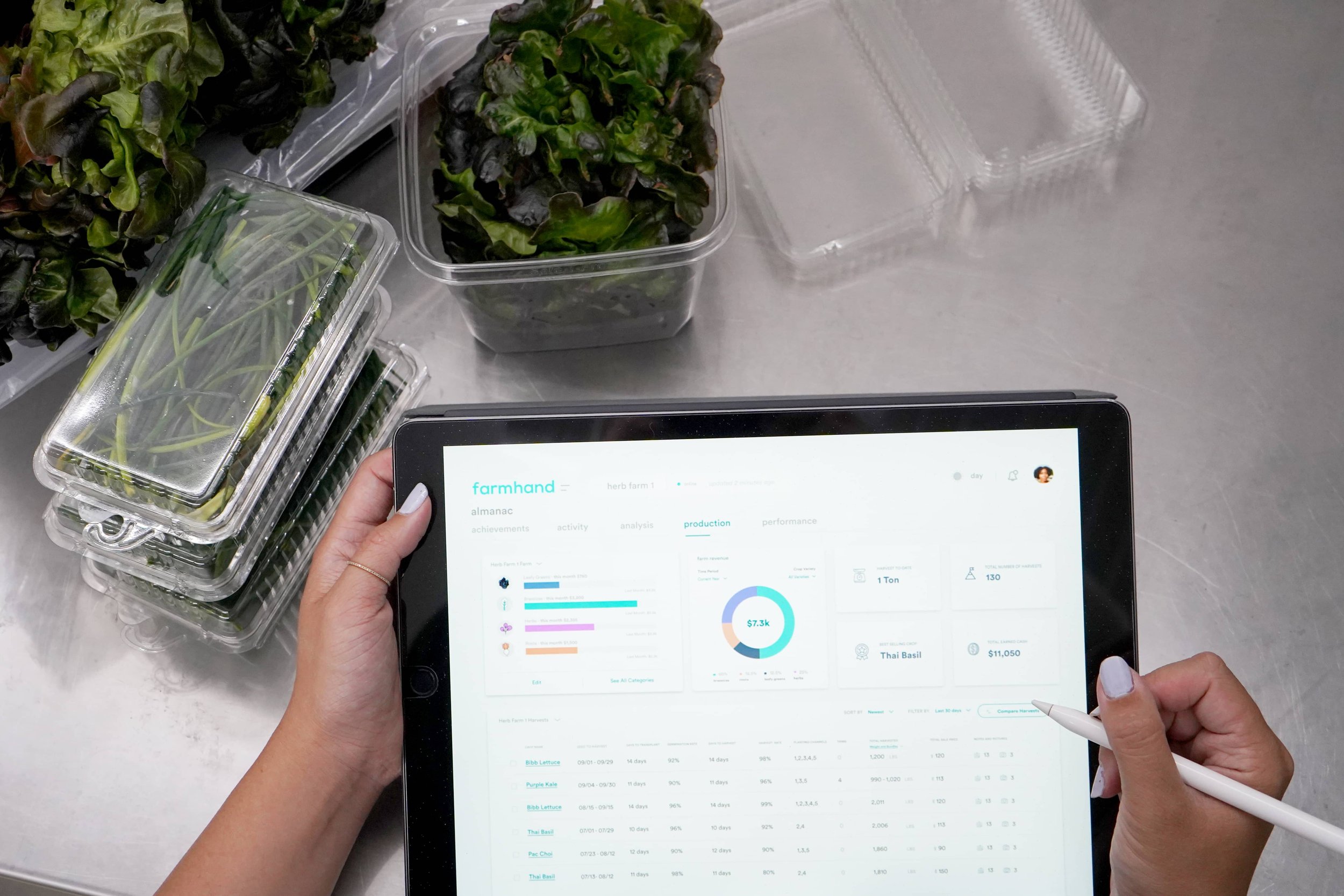
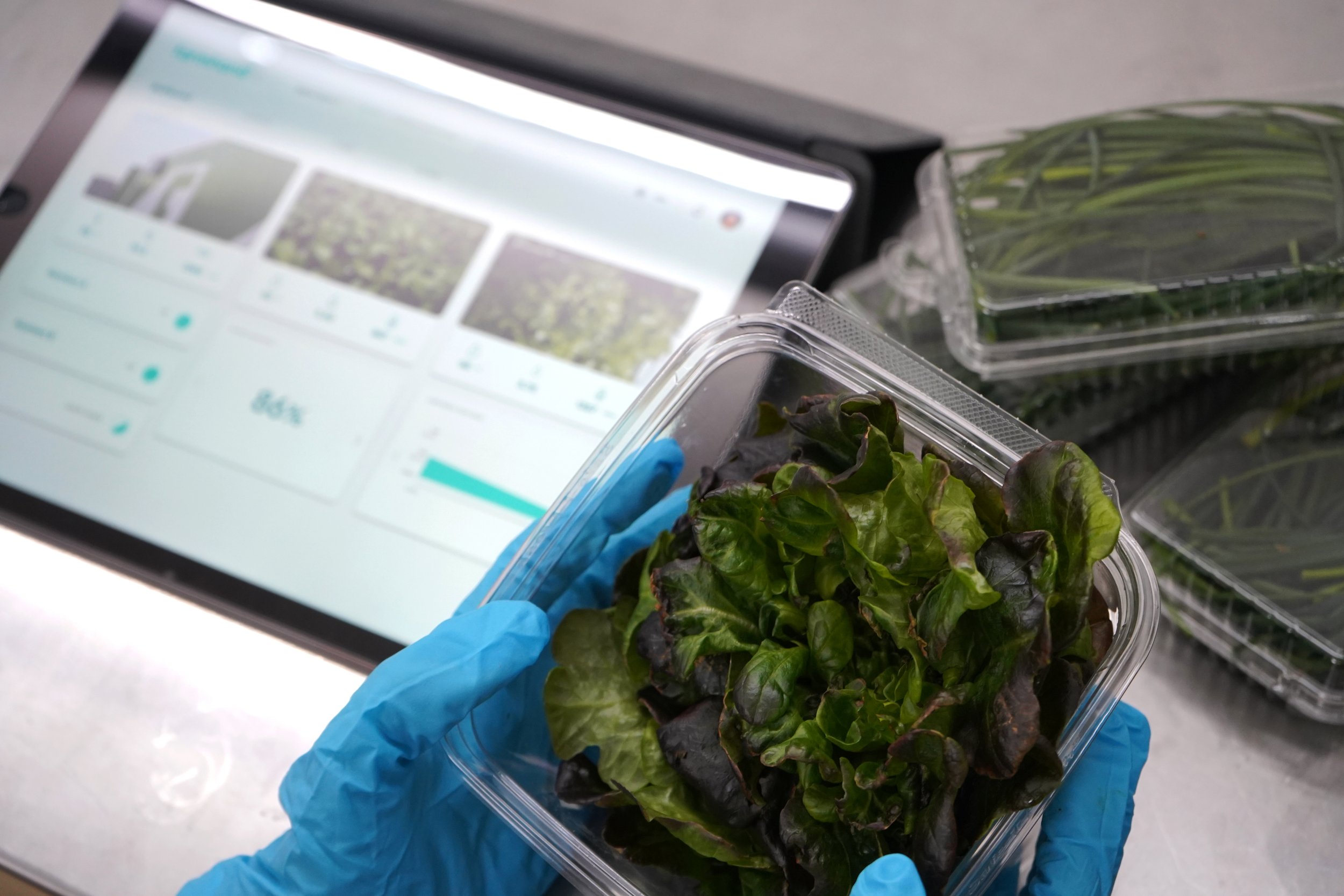
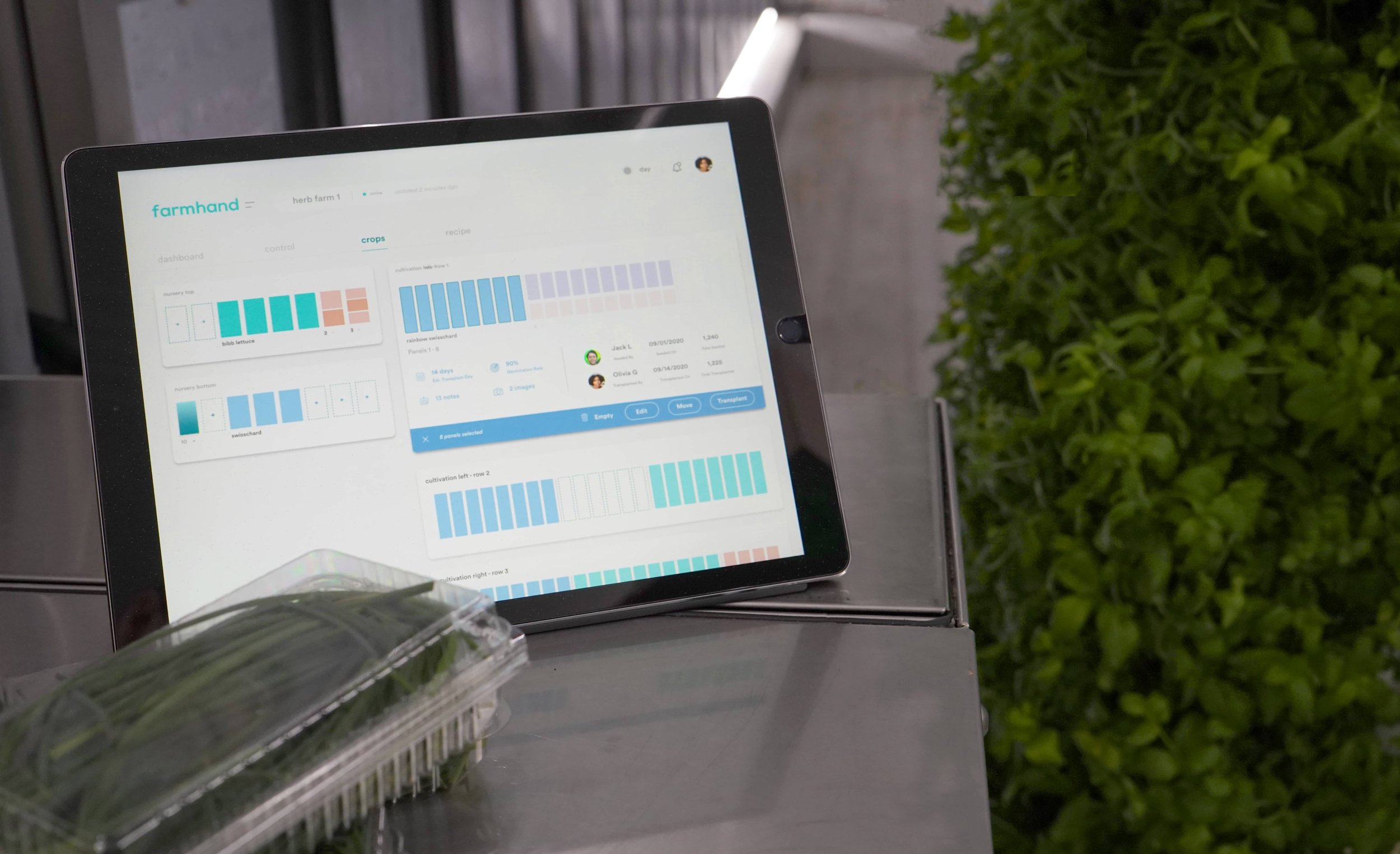
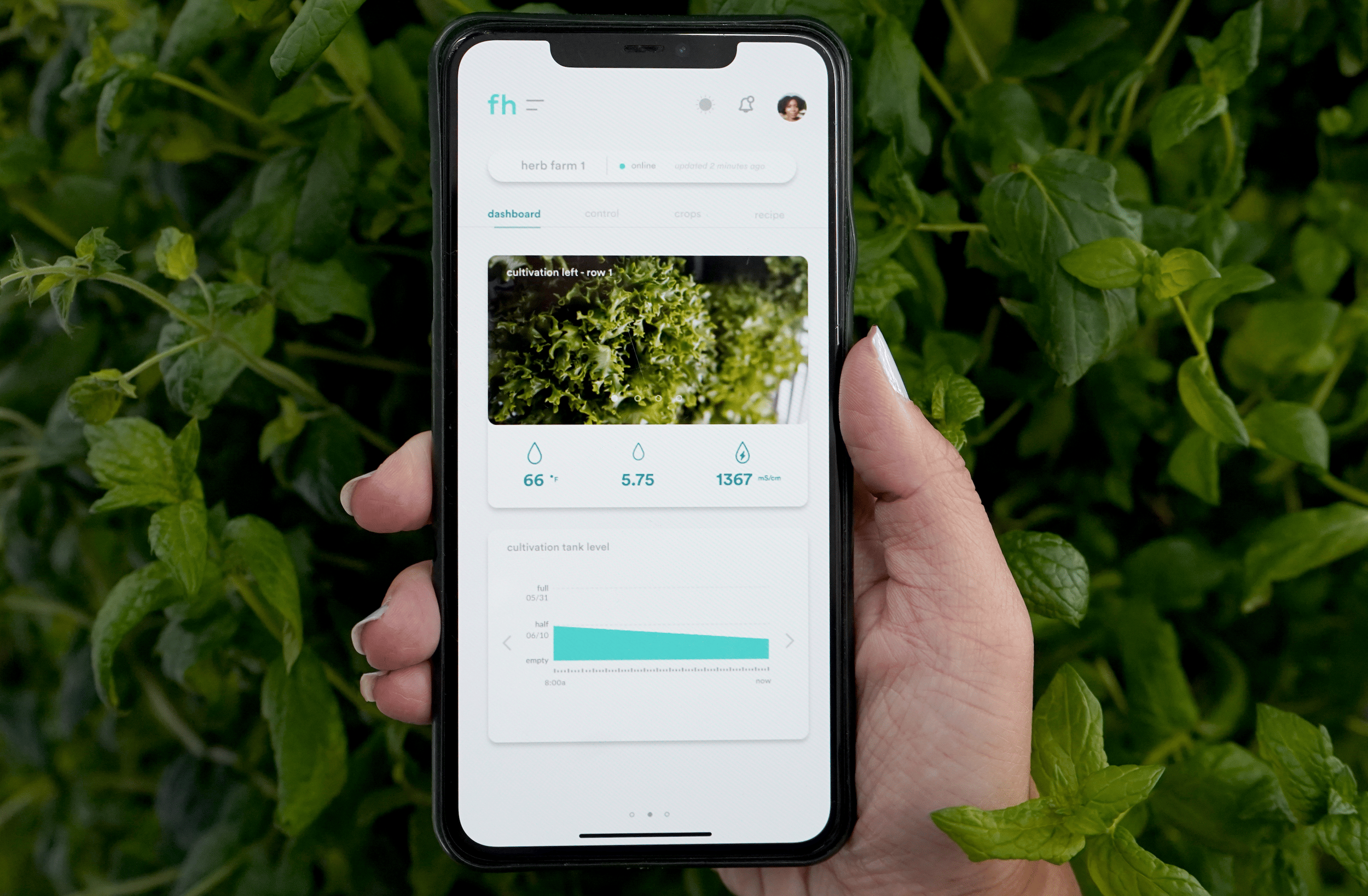
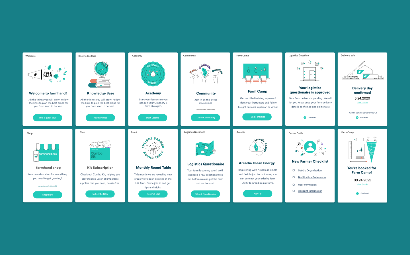
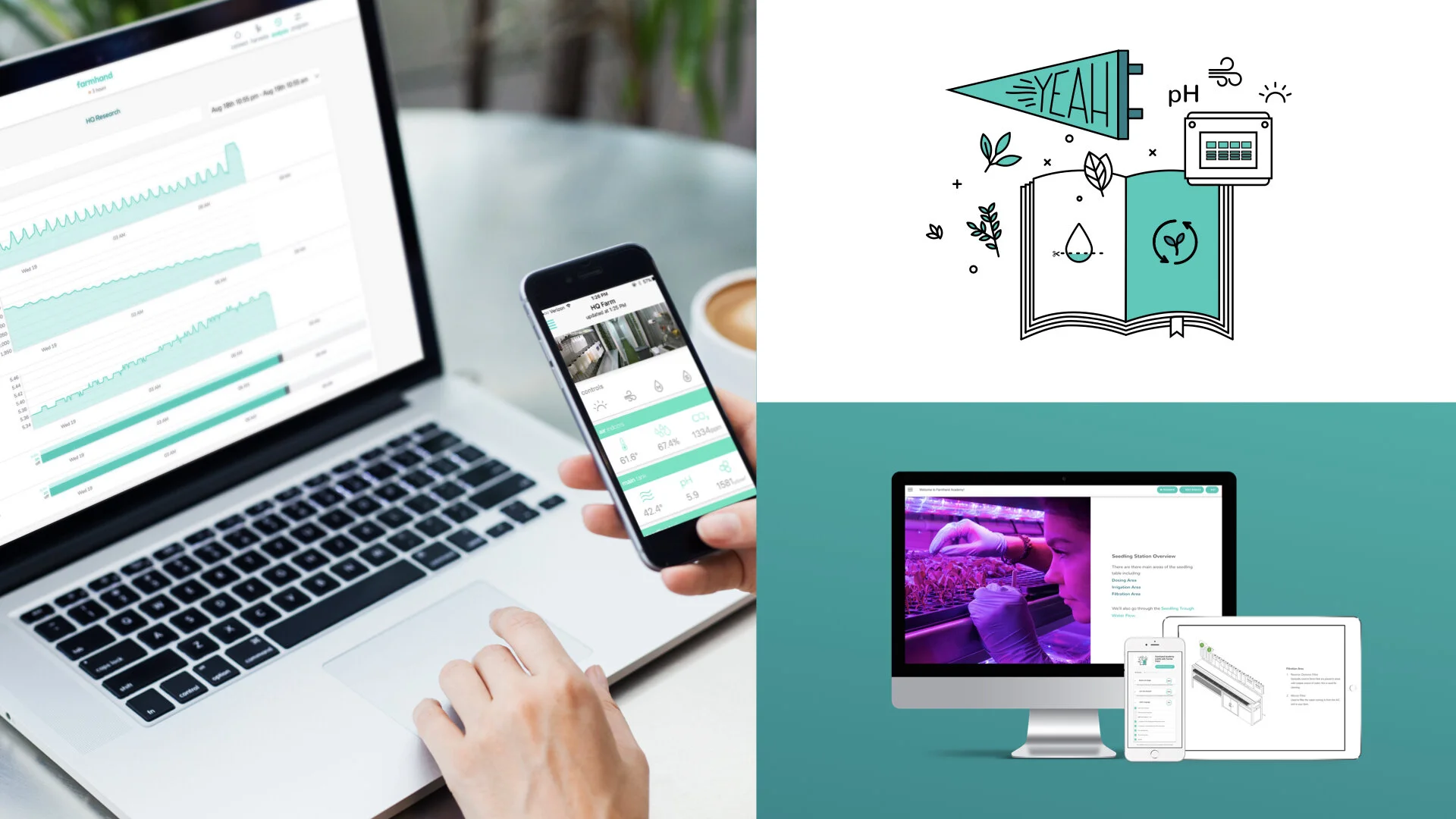
The farmhand suite of apps lets you monitor, manage and shop for your entire farm operations.
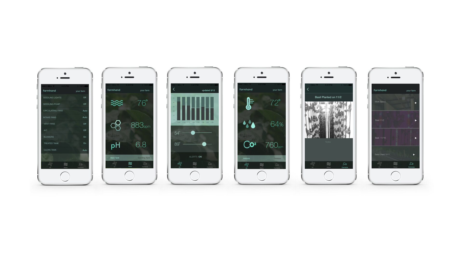
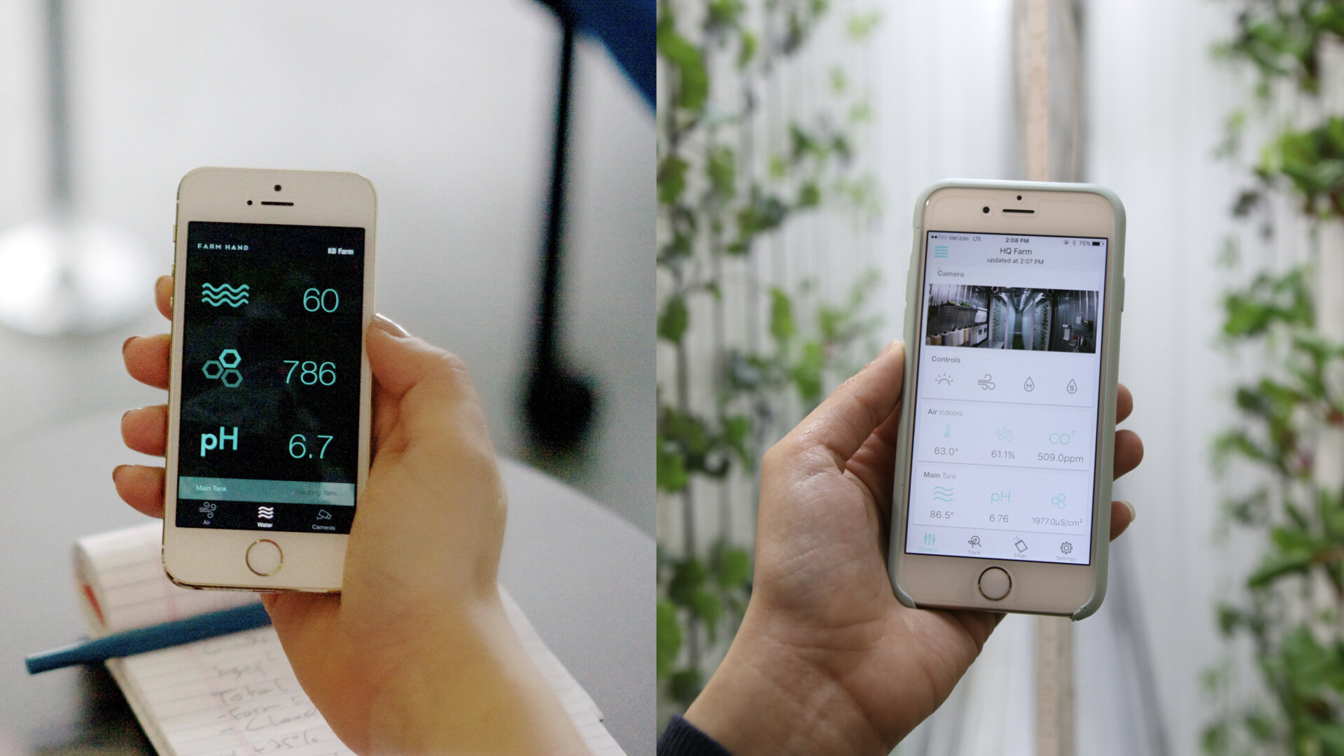
I inherited Farmhand’s legacy branding back in 2014. Farmhand was the first iOT farming software in 2014, a modernized and intuitive app that enables farmers to monitor and control their farm through Agrowtek. However the color palette didn’t reflect the friendly helping hand that the name suggests.
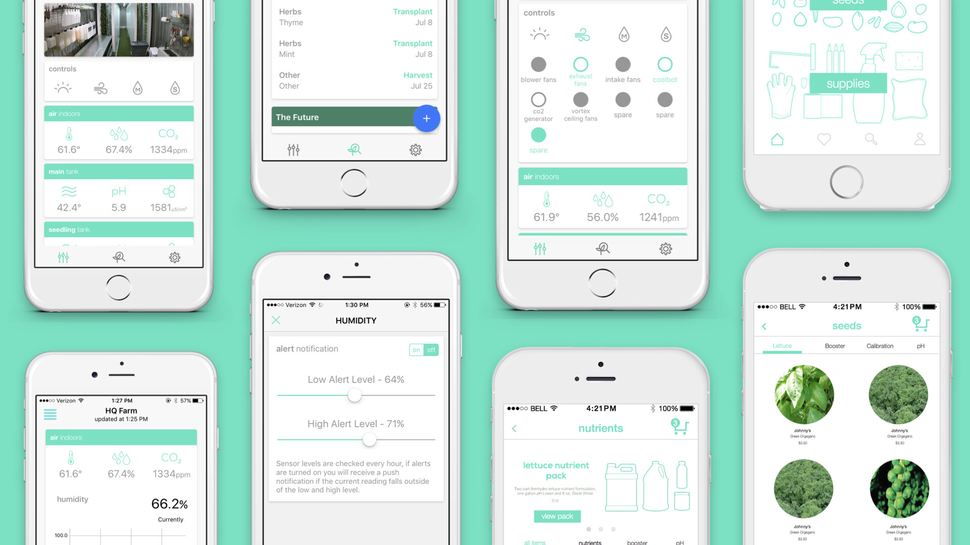
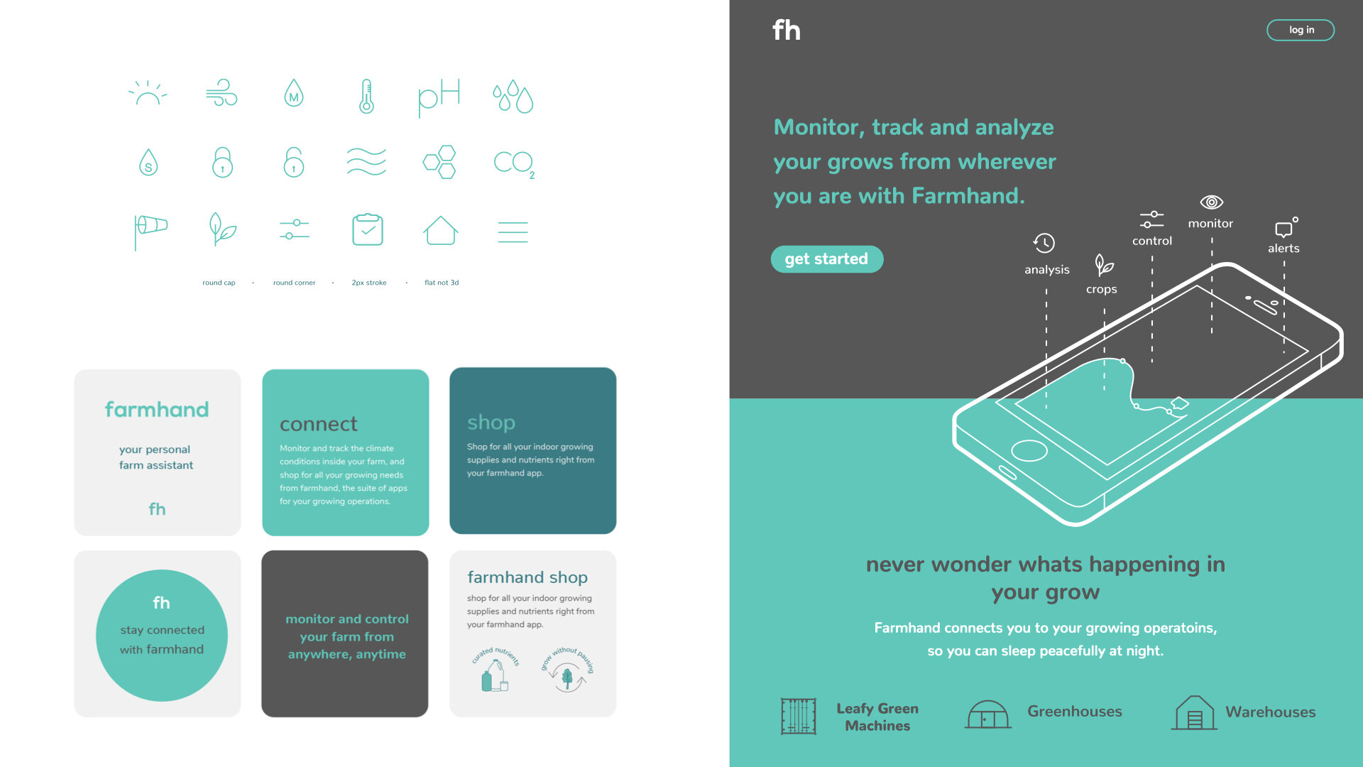
The rebrand of farmhand was more than just giving the users a nicer interface; it’s about empowering anyone to start farming at ease. A lighter color palette with customized iconography made it more approachable and rethinking the visual language of inputs and outputs made it more intuitive. And along with a new logo, farmhand was reborn.
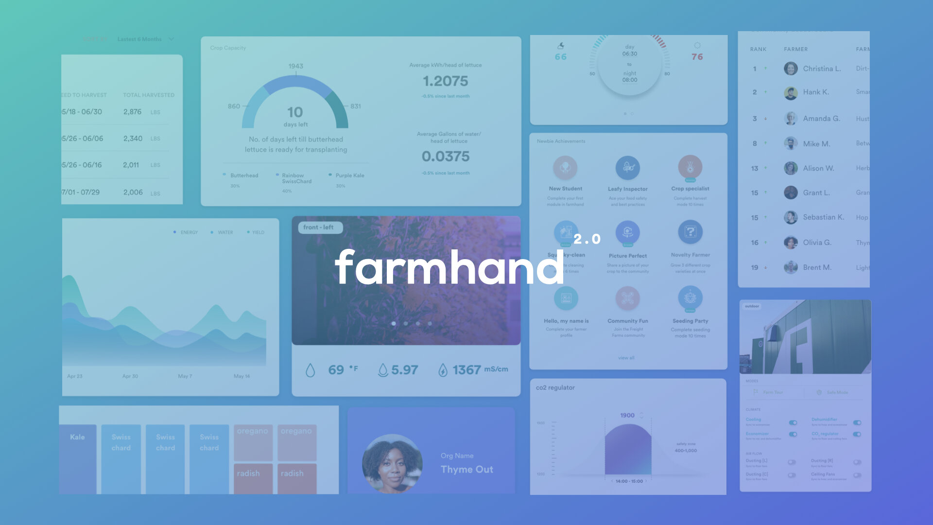
The color a brand chooses to present themselves is the most tangible representation of who they are. the farmhand green boldly anchors farmhand’s visual language, distinguishing the brand within todays landscape of iOT farming software.
YEAR
2014 - Present
ROLES
Branding and identity Logo development
UI and UX
User journey development
User testing
Working wireframe and mockups
Digital and printed collateral
Iconography and illustration creation